|
External Packages (page 31 of 38) |
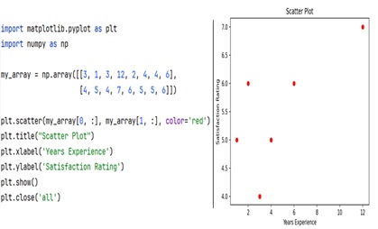
Here is an example of a scatter plot that uses numpy arrays for the data on the x and y axes. Scatter plots are ideal for visualizing the relationship between two continuous variables. Notice the use of the color keyword argument to change the colors from the default to red. This example also set the x axis and y axis labels to increase the readability of the plot.