

|
|
Tutorial: Data Analysis with Excel |
|
|---|
Data Plots in ExcelPlotting data in Excel is pretty straightforward, and the plots can be made to look pretty nice. Let's take a loot at our copper flame AA data again (click on the image to download the Excel file). 
To plot the calibration curve, simply select the data and select "Chart" command of the Insert menu. 
There are a variety of different chart types. About the only one that you will ever need for scientific data is the "XY (Scatter)" chart type. Do not choose the "Line" chart type - in this chart, the X-data are considered labels, rather than values. 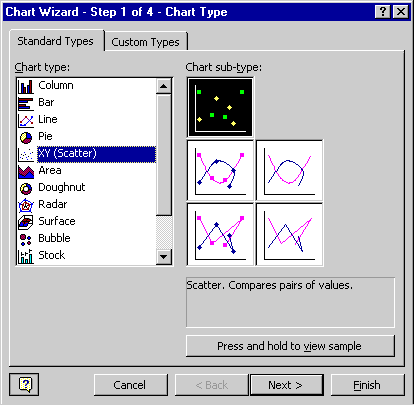
Follow the instructions of the Chart Wizard to create the graph. Excel's default scatterplot looks like the following screenshot. 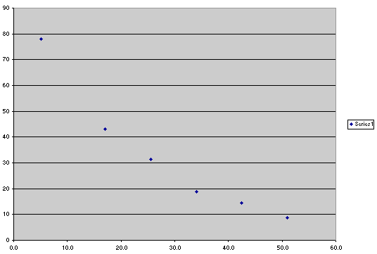
I personally prefer a graph that looks similar to the following image - it is less cluttered. You can change the properties of an object on the chart by selecting it and then choosing Format | Selected ... from the menu (you can also hit Ctrl-1 or simply double-click the object). 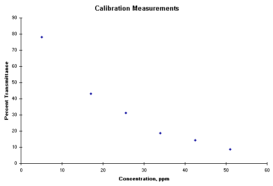
Plotting the calibration data forces us to immediately notice that our calibration curve is far from linear. The problem is that we must use the absorbance, not the percent transmittance, as our signal. Let's do so and then check the linearity. In order to plot the data, you must be able to select two columns of data that are not adjoining. After selecting the X-block, hold the CTRL key before clicking on the first number of the Y-block. 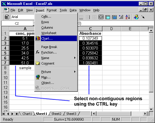
After plotting the data, adding a linear trendline to the plot gives the reader a little more information. 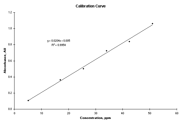
|
