
 |
External Packages (page 35 of 38) |
A pairplot is a data visualization that plots pairwise relationships between variables in a dataset, making it easier to understand the data's structure and correlations. Pairplots are particularly useful when analyzing the data across different levels of a categorical variable. The below example demonstrates a pairplot with the observations color coded by two offices. Seaborn has a pairplot function that accepts data in the form of a pandas data frame.
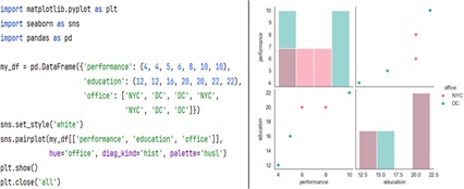
The diagonal plots can be customized to show different types of distributions. By default, Seaborn uses a histogram, but you can change it to a kernel density estimate (KDE) plot (e.g., diag_kind='kde').